Creating a new in-warehouse way to apply for CIBC Costco Mastercard at Costco
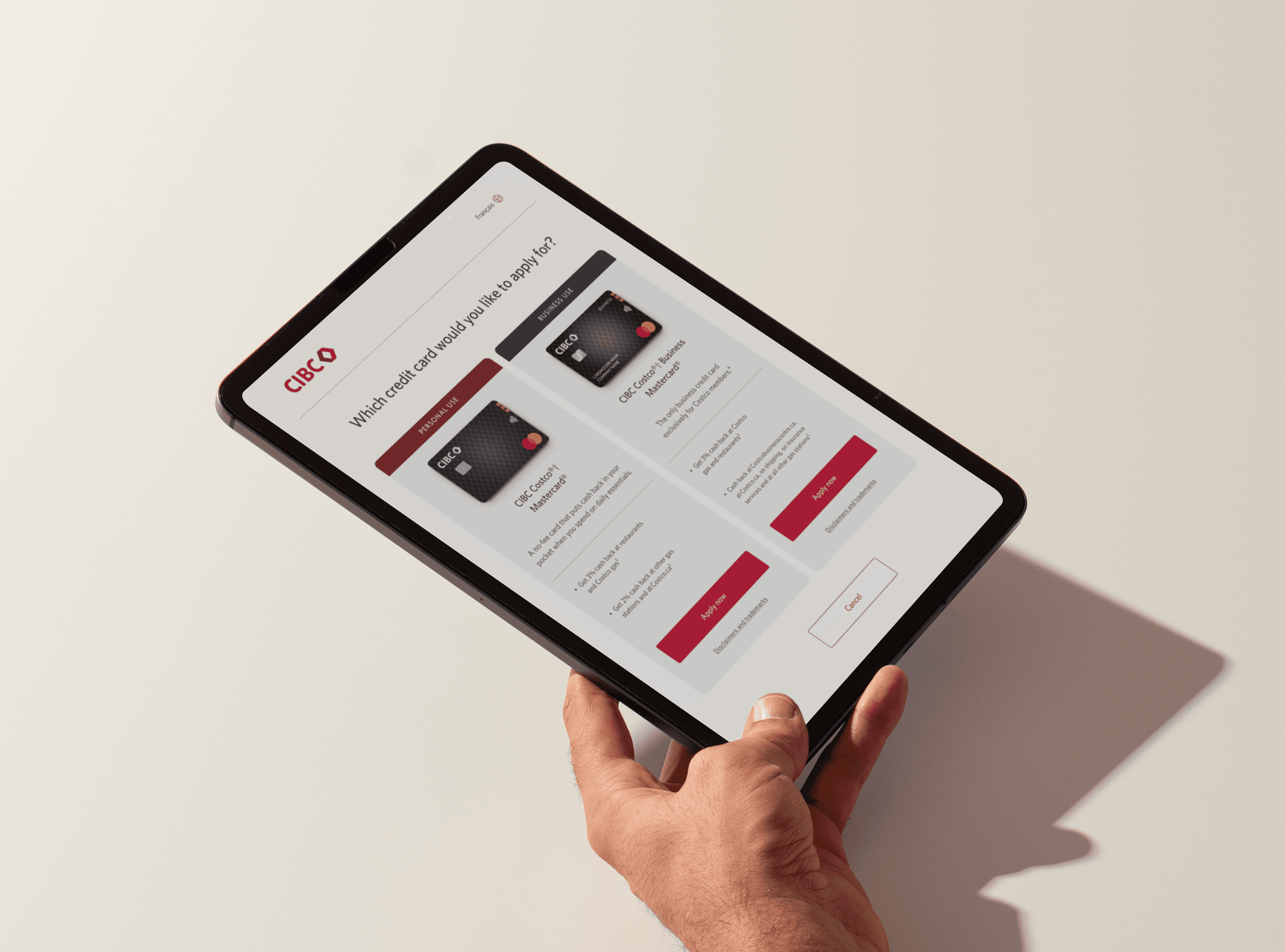
I designed a tablet experience that enabled Costco members to apply for a CIBC Mastercard while they were in the warehouse—rather than relying on online applications or call-centre support afterward.


| Product designer |
| Product, engineering, business stakeholders, Costco, content, legal/compliance |
| 2026 / 6 months |
| In-store application experience, tablet UX, card comparison, content hierarchy, prototyping |
Summary
Costco members could learn about a CIBC Mastercard in the warehouse, but they could not apply there. The existing experience created a gap between customer interest and action, relying on QR codes, pamphlets, online applications, or call-centre support.
What I owned
I led the product design for the tablet experience from early discovery through prototype delivery. My work included competitive research, information architecture, interaction design, content hierarchy, prototyping, and alignment with partners across CIBC and Costco.
Costco members could not apply in-store
The existing journey broke the connection between discovery and application. By the time members left the warehouse to apply later, the offer was no longer in context.

Closing the gap between interest and application
The opportunity was to help members understand their card options and apply while they were still in the warehouse, with a Costco representative available to guide them when needed.
BEFORE
The application started after the warehouse visit
Member-led
01
Discover card offer
02
Scan a QR code or take a pamphlet
03
Leave the warehouse
Application deferred
04
Apply later, outside the warehouse
AFTER
The application could begin in the warehouse
Member-led with representative support
01
Discover card offer
02
Discuss card options
Guided support
03
Review the application process on a tablet
04
Apply in the warehouse
Support available
Defining the in-store experience
Looking at the current Costco journey and comparable bank flows helped clarify what members needed from an in-store application experience.
01
Bring guidance and action together
A Costco representative could answer questions, but the next step still led outside the warehouse. The tablet needed to support a shared conversation, then give shoppers a direct way to begin.
02
Keep the decision in the moment
A Costco visit is already busy and a credit-card application is rarely planned. Instead of sending people to a QR code or pamphlet, the flow needed to help them explore the offer and decide whether to continue before leaving the warehouse.
03
Make card options easy to understand
CIBC Costco Personal and Business Mastercards serve different needs but a dense feature list would slow down an in-person conversation. The comparison needed to surface the differences that mattered most, with details available when needed.
04
Make an unexpected application feel easy
After a full Costco trip, applying for a credit card should feel quick and low-pressure. The flow skipped the CIBC login, used eligible Costco membership details to reduce re-entry, and clearly explained that CIBC would follow up after submission rather than provide an immediate decision.
Key moments in the tablet experience
The tablet was designed around three moments: choosing the right card, understanding what applying involved, and submitting a quick, privacy-conscious intake.

See the warehouse journey come together
What I learned
This project showed me that financial applications are not only forms—they are moments of decision. In a busy retail environment, the design needs to respect people’s time, make the choice understandable, and create trust before asking for personal information.
I also learned that partner experiences work best when the handoff is designed as carefully as the interface itself: Costco could support the conversation, while CIBC could handle the sensitive banking relationship and follow-up.
What I'd explore next
I would test how shoppers interpret the personal and business card comparison in the warehouse, measure where they pause or exit the intake, and refine the representative’s role at each stage.

Michelle Lee
Product Designer ⌄
Open to roles