Digital Client Onboarding
Designing a clearer path into digital banking.


| Product designer |
| Product, research, design, content, engineering, and business partners |
| Nov 2025 - Mar 2026 |
| On hold after initial design phase |
| Research synthesis, UX strategy, interaction design, prototyping, usability testing |
📌 Note: This case study documents the scope of work completed during my involvement.
Summary
I led the early design direction for an onboarding redesign that explored moving authenticated and unauthenticated banking clients from legacy systems to a modern platform.
What I owned
I helped shape the research questions, participated in research sessions and synthesis, framed the core opportunity, explored self-directed, guided, and hybrid interaction models, developed prototypes, and partnered with product, content, research, and technology stakeholders to evaluate the direction.
Making the first step feel easier
Across all onboarding tasks, the experience was converting at 5.3%.
Digital Client Onboarding helped new and returning clients complete important setup tasks after being approved for a CIBC product. But the experience presented too many possible actions at once, making it difficult for people to understand what mattered most or what to do next.
This suggested a broader system problem: clients were hesitating, the business needed stronger funding and re-engagement, and the product was not clearly guiding people toward a valuable next action.
Designing within competing needs
As clients become accustomed to simpler digital experiences, onboarding needed to go beyond completing setup tasks. It needed to give them a clear reason to continue.

Current State
The onboarding experience appeared after login and offered clients a list of setup tasks to complete. While this gave people flexibility, it did not clearly guide them toward the next best action or make the value of continuing feel obvious.
Landing page: one-task mindset, weak prioritization, unclear continuation value.
The landing experience encouraged single-task completion.
The hierarchy made exit easier than continuation.

Post-task confirmation: low momentum, weak guidance, easy exit.
The confirmation moment suggested another task, but did little to carry progress forward.
The hierarchy made it easy to return or exit before continuing.

Research & Framing
I partnered closely with research to understand how clients prioritized onboarding tasks. Those insights helped us move from presenting every task at once to guiding clients toward a clearer first step.
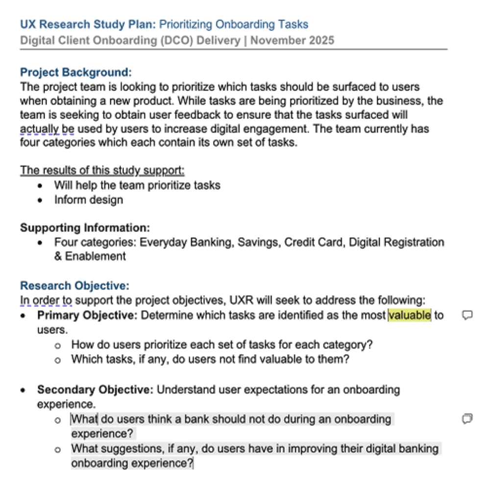
Shaping our research
I helped draft Maze questions, observe sessions, and identify where clients needed guidance.


The strategic direction
Guide clients toward the next best action without taking away their control.
Bridging the design
Guided upfront, flexible over time
Constraints and tradeoffs
The design needed to support different levels of client confidence, work across several entry points, and remain feasible within legacy system constraints. That meant the experience could not assume a single linear journey or depend on a completely new platform architecture. More guidance could reduce uncertainty, but too much direction could make the flow feel restrictive.
Exploring the solution space
I explored three models for the onboarding flow to see how each balanced prioritization, control, and flexibility. I used tools like Claude, Moonchild, and Figma Make to generate a range of early ideas quickly, then evaluated and refined them based on the research, technical constraints, and the need to preserve user choice.

01 Self-directed flow
Keep the flexibility, improve the experience
I kept the existing self-serve approach and focused on making it more engaging and easier to scan. Clients could choose where to begin, but still had to decide which tasks to prioritize.

02 Guided flow
Create momentum through stronger direction
I explored a more guided, gamified approach inspired by other fintech experiences. It created momentum and made the next step clearer, but risked feeling too rigid for clients with different needs.

03 Hybrid
Guide the first step, then open up
I combined the two approaches by guiding clients toward one clear first task, then giving clients more flexibility as they progressed. This helped them get started with confidence without locking them into one sequence.

The direction I chose
The hybrid model offered the best balance
It gave clients a clear starting point without deciding the entire journey for them. I translated this into a focused “Get started” experience, a visible first task, and a broader hub where clients could track progress and continue when they were ready.

The result was a guided first step that gradually opened into a flexible, self-serve experience.
Want to see it in action?
Outcome
The final direction struck a better balance between guidance and flexibility. It gave clients a clear place to start without locking them into one path. Although the initiative was later put on hold, the work gave the team a stronger foundation to build on in the future.
Reflection
This project reminded me that good onboarding does not have to show users everything at once. It can start with one clear, manageable step, then give people more control as they become comfortable.
A few practical details
What's the current project status?
The initiative was later put on hold because of funding changes. The work shown here is a concept and prototype, not a launched product.
Why are there no metrics yet?
The work did not reach launch or formal measurement, so there are no production metrics to share. I’ve focused on the decisions, tradeoffs, and prototype outcomes instead.
What was your role?
I led the product design direction, including research synthesis, concept exploration, interaction design, prototyping, and the final case-study narrative.

Michelle Lee
Product Designer ⌄
Open to roles